More Tinkering in Progress
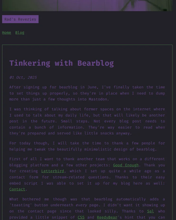
Quite a few people pointed out that the text was hard to read, due to the contrast being too low.
The issue might be me. I usually don't like too high of a contrast because it starts hurting my eyes and giving me odd visual artifacts the longer I look at the text. I can agree with the text being too dark, since I was going for a gloomy vibe.
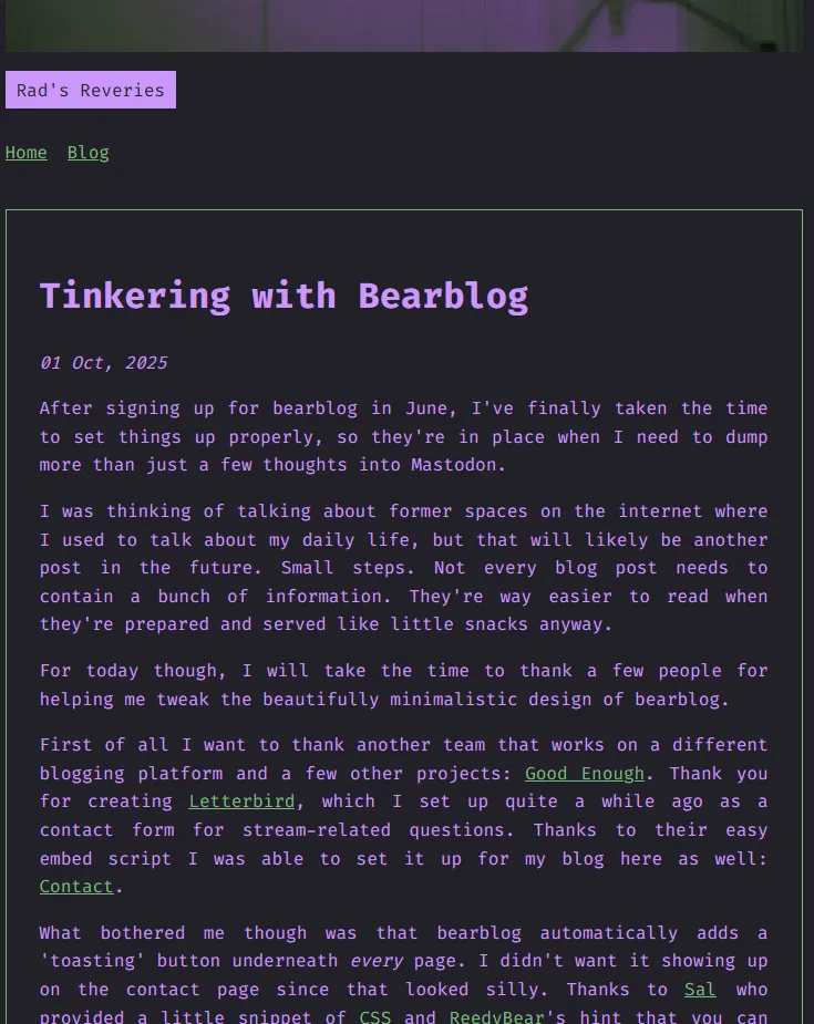
When I tried to get the text to be more accessible with some tools it only brightened it up and that didn't look quite right, neither did it spark joy for me.
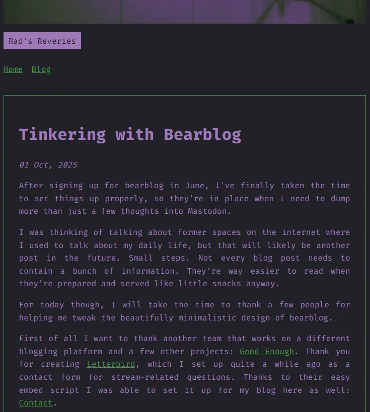
After a while, I stumbled upon app.contrast-finger.org. It gives you a range of valid colours that are also close to the initial colour, which is way more helpful than simply brightening the colour and robbing the site of its initial colour scheme. Yay!
The only element that is too low in contrast now, according to several contrast checkers, is the "Powered by Bear ʕ•ᴥ•ʔ" footer that automatically dims its colour.
Along the way I learned a bit more about light sensitivity and that I might have to wear my blue light blocking glasses more often..
Thank you to elle, Double AA and kaiserkiwi for taking a peek at my post and letting me know. 🤗


